My degree project was a book documenting the Irish Diaspora’s journeys from Ireland to England. I photographed and interviewed people in the various Irish centers around London: the London Irish Center, the Luton Irish Forum and the South London Irish Association. The book itself was hand-printed and bound but my bookmaking skills are very lacking! As such, I enlisted the help of my friend Chloe (a 2015 UAL Wimbledon graduate in Print and Time-based Media) to help me fix the binding and structure of the book itself.
Chloe won the Wandle Studio Prize for 2015/16 so she has use of a studio space at Merton Abbey Mills where she runs an “alternative book-makery” called Object Book.
Original bookHow it stoodLying flat
Attempt at attching the covers
I attempted to attach the covers and put too much glue on the frontThe binding was too loose so pages would moveCutting the binding off each folioPlacing the first coverSewing the first sectionTying a kettle stitch at the endSewing the fourth folio to the third with a kettle stitchThe cross stitch was made by putting the thread through two layers of thread on the folios and making a X shape and tying a kettle stitichExposed bidingKettle stitches at the end of each folio
Flattening in the nipping press
PS: I’m doing photo-book narrative workshops at Object Book on the 6th of August. More details to follow.
Two weeks ago in college, we got to link up with the Fashion Design students and photograph them in the studio. Here are some photos from the day. They’re not my best as I’m only getting properly into studio portraiture now but I’ll post up more photographs as they come! Hope you enjoy.
I know I’m a day behind, I was out for dinner last night and didn’t get home til late, I’ll be more diligent next week with posting on the day I’m supposed to! This week it’s “Two Of Us”, a photographic project by Fan Shi Shan. This is amazing, it’s a portrait series on people who grew up during China’s one-child policy. It is a comment on that policy and on what could have been. The photographs themselves are haunting as they could have been a reality, if the child had been born in another country.
All images from PetaPixel (click on image to go to website)
What do you think of this series? Is it a comment on China‘s policies or is too “out there” to suggest that the policy is backwards?
If you liked this, please subscribe on the left <3
Here’s the second installment of my Monday post series: photoshoots I’ve loved.
This series is by Txema Yeste for Numero China April 2012 issue. This is amazing. The images are quite avant-garde and are dark and Gothic but are colourful and sensual at the same time. The images have quite an experimental feel to them, which is probably why I love them so much.
Following on from yesterday’s post about series and the like, here is the first of my Wednesday posts. I’m shooting my friends Chesney and Conor in studio tomorrow so therefore this post is about what I’ve been looking at for ideas. I’ve been thinking a lot about low-key lighting and about how dramatic it can look. I love low-key lighting, how getting the shadows and light just right can either make or break a portrait. The following are photos I’ve been looking at for inspiration.
I’m probably gonna go more along the route of the last photo and add some glitter into the image aswell, just to see how it goes. I’ll post up some photos when they’re done!
Here’s the first of my Monday post series: photo shoots I’ve loved. This one is “Disturbed Dream Captures” by Kevin Carrado. This shoot is absolutely amazing. I’m a little obsessed with the notion of vulnerability and isolation in photography so this was right up my alley! Using frames within photographs is also another fascination of mine so I absolutely love this series! The images use a muted colour palette and are slightly dystopian, with fragmented bodies climbing into and out of frames. They have a surrealist nature to them so they look almost like a Dali painting.
The Numero spring 2012 fashion shoot is an ethereal exposition of spring style. The images are grainy and soft-foucsed, emphasising the model and the textures of the clothes. Wafts of chiffon frame the model and act as a sort of window to view the model through (In this, the shoot almost has a voyeuristic feel to it). The model herself adds contrast to the images, as her gaze is harsh and intense, contrasting with the rest of the image.
I came across this fashion shoot a couple of weeks ago and I’ve only had the time to blog about it now. My birthday was two weeks ago & I’ll have a blog post up about that soon too. For now though…
“Sun Should Be A Girl” is a fashion editorial by Marta Streng. This shoot has everything that I’m obsessed with and love in photography right now: bokeh, tough clothing, heavy makeup, lens flare and a juxtaposition of the model and the interplay of light (The way the photographs are composed, you would expect to see something a lot more feminine and girly photographed), so you can understand my squeal of delight when I came across it a couple of weeks ago. The shoot is grungey: dirty streets and buildings compliment the model’s clothes, pose and makeup, while the interplay of light gives the photographs a feminine feel.
I came across this fashion shoot the other day on the Trend Hunter blog and was completely blown away. It was shot by Frank Bayn and Steff Rosenberger-Ochs (what an amazing surname!). The images feature a model clad in couture and staring dreamily at the camera, looking for all the world a spoiled little brat. The viewer at first looks at the model’s haughty expression and suggestive pose and then notices scenes of destruction and mayhem in the windows (I think they’re mirrors and only a motif of windows… but someone correct me if I’m wrong) behind the model. It is almost as if the model is frozen in time and doesn’t notice the destruction around her. The title “Don’t Touch…” seems to say that the model doesn’t want the luxury and prestige portrayed in the photographs to go away and wants to be self-absorbed and oblivious forever. I think this is also saying that there are more important things to be worrying about than looking good, which is a breath of fresh air in this consumerist, “buy, buy, buy”, “more, more, more” culture we have.
I had a day off from college today so I decided to visit the Irish Museum of Modern Art to see the new exhibition, Conversations. After getting lost and wandering around the trendy apartments in south quarter (and daydreaming about how we wanted to live there…), we finally found the IMMA. It was well worth the wandering around though, I was literally in awe at the images. I literally turned into “photography fan-girl”, much to my boyfriend’s dismay. I walked around going: “THEY HAVE A LANGE PHOTO! THEY HAVE A SOTH PHOTO!” and squealing when I saw photographer’s works that I admired. I loved all the photographs, some that I knew, from photographers I know and some that I’ve never seen, from photographers I didn’t know. The arrangement of the images played a big part in their meaning, they were placed in “conversation” with each-other, a photograph from the 1800’s alongside a photograph from 2003. The images complement each-other in a way you wouldn’t expect.
From the IMMA website: “Modern works are juxtaposed with older works, European with American, and staged subjects with documentary images. These conversations create unique visual groupings, including images of visitors responding to art in museums, such as Thomas Struth’s Audience 4 (2004), which shows people gazing upward at Michelangelo’s statue of David at the Academia Gallery in Florence, and Musée du Louvre 4, Paris (1989), where visitors contemplate Théodore Géricault’s famous Raft of the Medusa in a Louvre gallery.”
The stand-out images for me were:
Neeta Madahar’s image “Sustenance 104, 2003”
Toni Schnider’s image “Switched”
David Hillard’s image “Dad”
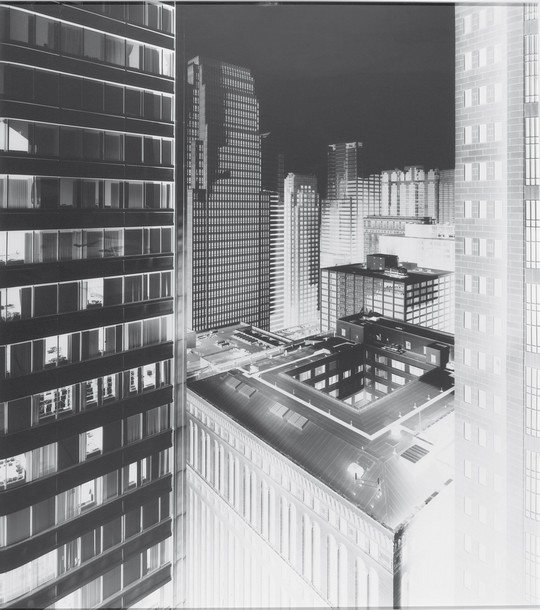
Vera Lutter’s image “135 LaSalle Street, Chicago, VI”
The exhibition is produced by the Museum of Fine Arts in Boston and runs til the 22nd of May at the Irish Museum of Modern Art, Military Road, Kilmanham Dublin.