I originally had this up on the main section of my website but then I thought that I should just leave that for art- and conceptually driven projects so blogging about it instead!
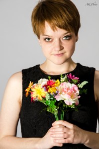
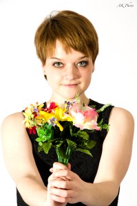
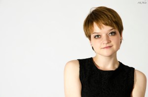
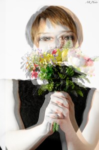
I shot these portraits for the Agagpe Ministries website a couple of months ago and I’ve only just gotten around to posting them up now!
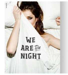
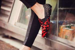
This week it’s an editorial entitled “Summertime Madness”, which was styled by David Nyiri. Nyiri is stylist extraordinaire, he has styled shoots for everyone from Marie Claire to Vodafone. This shoot looks like the pages of a fashion editor‘s sketchbook, with annotations in the corners of each page. This creates a juxtaposition with the toughness of the model, her clothes and the childish writing at the top of each photo. It celebrates youth and urban culture with vibrant colours and young models with youthful energy in each photograph.
All images from Trendhunter, click the images to go to the webpage.
What do you think of these? Are they too gaudy?
If you liked this, please subscribe, on the right <3
This week it’s “Corpus” by Alejandra Figueroa. I was given this book for my birthday and I’m absolutely in love with it.
Alejandra Figueroa was born in Mexico but moved to Paris in 1992. Her work is mainly concerned with sculpture, stained glass and architecture. She was commissioned to photograph the statues of the world’s greatest musuems.
This almost-A3-sized hardback book is a study of the human form. It is the fruit of several years of labour. It features abstract imagery of the beauty of the nude figure; parts of bodies: hands, feet, parts of faces. The images are presented in such a way that the viewer thinks they are viewing real nudes, flesh doesn’t look like stone. In this way, Figeroa acts as sort of an “anti” Medusa figure with her camera: instead of turning people to stone with it, she is turning stone, human. This book is a beautiful monograph of fine-art abstract imagery.
All images from Alejandra Figueroa.fr. Click on the image to go to the webpage
What do you think of them? Are they “too abstract”?
I’ve been so behind on my blogging schedule at the moment, I’ve been so busy. *Regularly scheduled posting will resume shortly* (haha). Anyway, apologies and bad jokes aside, this week I’m going to talk about “Powder Dance” by Geraldine Lamanna. This series of photographs is amazing. She photographed dancers and used powder to accentuate the power and movement of the dance itself. Lamanna coated a dance instructor and her students with powder and let them show their moves to the camera. The resulting photographs are supposed to show “echoes” of movement. Compositionally, these photographs are perfect, the composition draws you in to the middle of the frame, to the dancer’s face. The lighting is great, spotlights illuminate the dancers and the powder separately so the viewer can see both equally well.
What do you think of these?
All images from Peta Pixel, click on the image to go to the webpage.
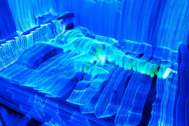
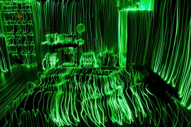
This week it’s Janne Parviainen’s images of rooms light-painted (is that even a word? Let me know in the comments…) with one LED light. These are amazing, they are all done in-camera, with no post-processing at all. Doing what he calls “Light typography”, he traces over the room’s surfaces with an LED while the camera’s shutter is open (which is what light painting is, essentially ;)). This images wouldn’t look out of place in the Tron universe.
What do you think of them? Are they too much work for the result they give?
All images from Peta Pixel, click on the image to go to the webpage.
Two weeks ago in college, we got to link up with the Fashion Design students and photograph them in the studio. Here are some photos from the day. They’re not my best as I’m only getting properly into studio portraiture now but I’ll post up more photographs as they come! Hope you enjoy.
This week on the fifteenth post in my series on “photo-shoots I’ve loved”, its David Jordan’s long exposure, out of focus images of fireworks. I’m always fascinated by long-exposure photographs so I think these are amazing, they look like abstract paintings. (They wouldn’t look out-of-place on a gallery wall either – it’s the wannabe curator in me coming out!). The composition is perfect, the viewer is immediately drawn towards the middle of the photograph, to the centre of the firework.
What do you think of them? Do you think they are too “arty”?
All images from Laughing Squid, click on the image to go to the webpage
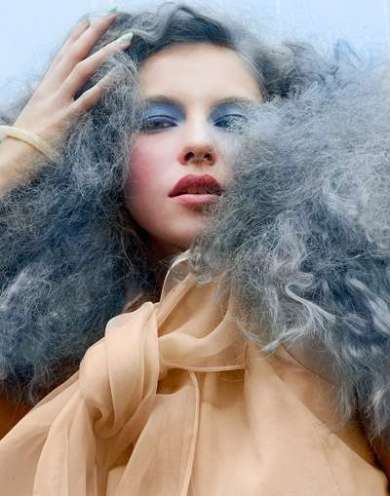
Hello again, I’m back to continue my series on inspiring and incredible images. This one is “Beauty School Drop-out” by Michael David Adams. The images are gaudy, with candy-couloured hair and strong makeup. This is reminiscent of Charlotte Free or even Helena Bonham-Carter in some images. The tight crop of most of the images adds to the overall composition, making you really look at the model’s hair and makeup.
Also…
Watch this space, I might have an extra something-something for you during the week (or even later tonight;)).
All images from Trend Hunter, click the image to go to the webpage
What do you think? Is the makeup with the hair too much?