The Numero spring 2012 fashion shoot is an ethereal exposition of spring style. The images are grainy and soft-foucsed, emphasising the model and the textures of the clothes. Wafts of chiffon frame the model and act as a sort of window to view the model through (In this, the shoot almost has a voyeuristic feel to it). The model herself adds contrast to the images, as her gaze is harsh and intense, contrasting with the rest of the image.


Tag: magazine
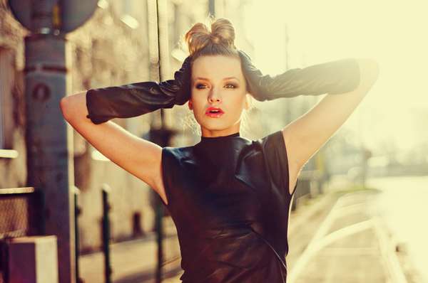
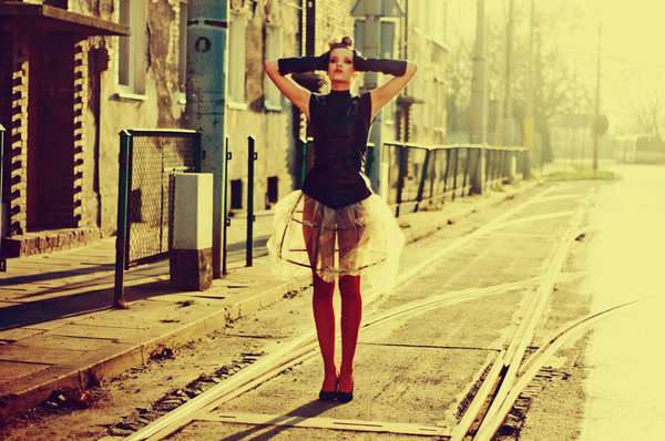
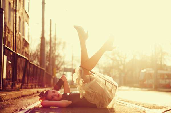
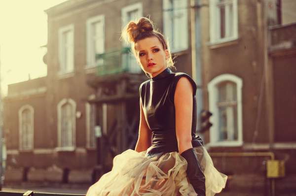
Sun Should Be A Girl – Marta Streng
I came across this fashion shoot a couple of weeks ago and I’ve only had the time to blog about it now. My birthday was two weeks ago & I’ll have a blog post up about that soon too. For now though…
“Sun Should Be A Girl” is a fashion editorial by Marta Streng. This shoot has everything that I’m obsessed with and love in photography right now: bokeh, tough clothing, heavy makeup, lens flare and a juxtaposition of the model and the interplay of light (The way the photographs are composed, you would expect to see something a lot more feminine and girly photographed), so you can understand my squeal of delight when I came across it a couple of weeks ago. The shoot is grungey: dirty streets and buildings compliment the model’s clothes, pose and makeup, while the interplay of light gives the photographs a feminine feel.


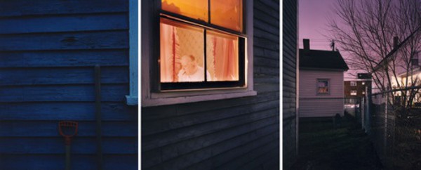
Don’t Touch My Universe
I came across this fashion shoot the other day on the Trend Hunter blog and was completely blown away. It was shot by Frank Bayn and Steff Rosenberger-Ochs (what an amazing surname!). The images feature a model clad in couture and staring dreamily at the camera, looking for all the world a spoiled little brat. The viewer at first looks at the model’s haughty expression and suggestive pose and then notices scenes of destruction and mayhem in the windows (I think they’re mirrors and only a motif of windows… but someone correct me if I’m wrong) behind the model. It is almost as if the model is frozen in time and doesn’t notice the destruction around her. The title “Don’t Touch…” seems to say that the model doesn’t want the luxury and prestige portrayed in the photographs to go away and wants to be self-absorbed and oblivious forever. I think this is also saying that there are more important things to be worrying about than looking good, which is a breath of fresh air in this consumerist, “buy, buy, buy”, “more, more, more” culture we have.


Conversations: Photography from the Bank of America Collection
I had a day off from college today so I decided to visit the Irish Museum of Modern Art to see the new exhibition, Conversations. After getting lost and wandering around the trendy apartments in south quarter (and daydreaming about how we wanted to live there…), we finally found the IMMA. It was well worth the wandering around though, I was literally in awe at the images. I literally turned into “photography fan-girl”, much to my boyfriend’s dismay. I walked around going: “THEY HAVE A LANGE PHOTO! THEY HAVE A SOTH PHOTO!” and squealing when I saw photographer’s works that I admired. I loved all the photographs, some that I knew, from photographers I know and some that I’ve never seen, from photographers I didn’t know. The arrangement of the images played a big part in their meaning, they were placed in “conversation” with each-other, a photograph from the 1800’s alongside a photograph from 2003. The images complement each-other in a way you wouldn’t expect.
From the IMMA website: “Modern works are juxtaposed with older works, European with American, and staged subjects with documentary images. These conversations create unique visual groupings, including images of visitors responding to art in museums, such as Thomas Struth’s Audience 4 (2004), which shows people gazing upward at Michelangelo’s statue of David at the Academia Gallery in Florence, and Musée du Louvre 4, Paris (1989), where visitors contemplate Théodore Géricault’s famous Raft of the Medusa in a Louvre gallery.”
The stand-out images for me were:
Neeta Madahar’s image “Sustenance 104, 2003”

Toni Schnider’s image “Switched”

David Hillard’s image “Dad”
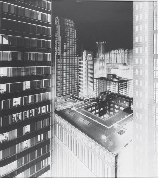
Vera Lutter’s image “135 LaSalle Street, Chicago, VI”
The exhibition is produced by the Museum of Fine Arts in Boston and runs til the 22nd of May at the Irish Museum of Modern Art, Military Road, Kilmanham Dublin.
Bon Duke
Discovered this guy yesterday and oh wow… he’s officially one of my favourite photographers. He seems to capture the emotion of the model in every photograph. It’s people like him that make me want to go into fashion photography even more.
Updates / Off Switch issue one.
I’m horribly inconsistent with this blog… and I’ve failed miserably at my Project365, which is terrible but I have lots of ideas for posts for the blog so I’m going to at least post regularly. Ideas for posts include: reviews of magazines, editorials, StumbleUpon finds and websites, my own photo-shoots, when I start a FETAC Level 6 in Photography in October and over the summer, I have so much planned. Moving swiftly on… speaking of magazines, I just discovered an AMAZING new magazine: Off Switch. It’s available in both electronic and print forms, although, I think the print version is a little expensive (€18). They only have one issue at the moment but wow… amazing. They’re releasing issue two at the end of the month and I’m excited for it already! Definitely one to watch (along with SuperMassiveBlackHole… shameless plug: IT’S IRISH!)
From Off Switch website: “Off Switch Magazine was born out of a desire to encourage people of all ages and backgrounds to get up and act upon their dreams. Whether that dream is taking a pottery class, learning to sew, starting a band, or becoming a self-employed artist, Off Switch is here to inpsire and remind readers that all things are possible. Full of beautiful images and words with the intention of sparking ideas and motivating mindfullness of self and surroundings, Off Switch is first and formost a reminder to live life fully…without an off switch.” – Off Switch magazine
